
TYPOGRAPHY
BRANDING
The Psychology of Typography in Branding
Why the fonts you choose say more about your brand than most businesses realize and how to pick typography that reinforces the right message.
Why Typography Communicates Before Words Do
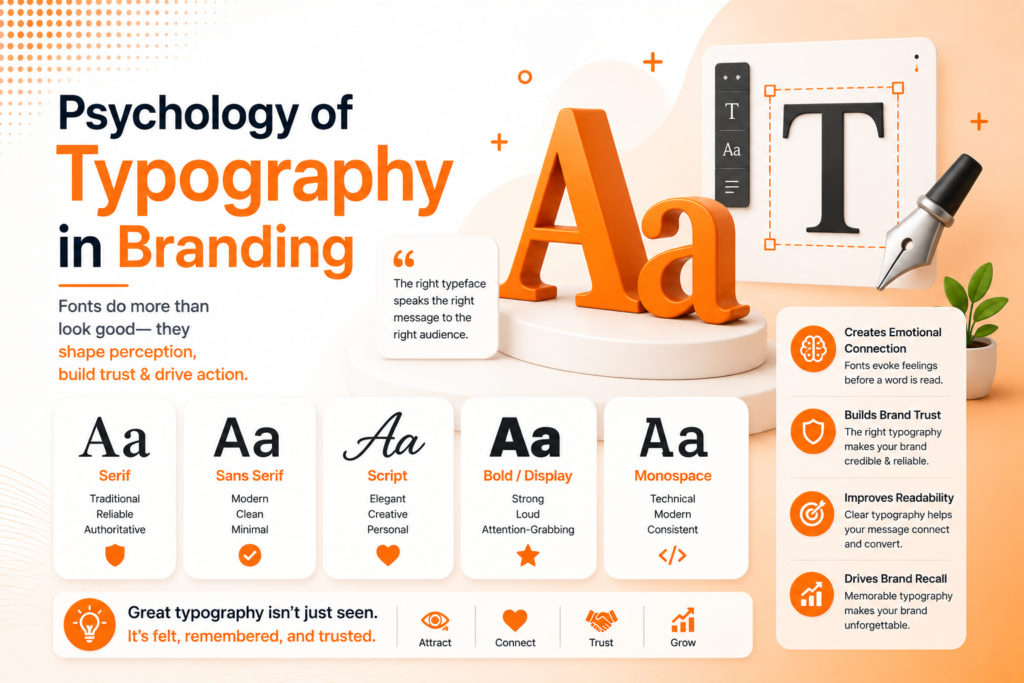
Typography in branding works on a level most people never consciously notice, yet it shapes perception within milliseconds of seeing a logo, headline, or piece of packaging. Before a reader processes what a word actually says, the shape, weight, and style of the letters themselves have already sent a signal about tone, trust, and personality.
Brand typography isn’t a purely aesthetic choice it’s a strategic one. A rounded, friendly typeface communicates something entirely different than a sharp, geometric one, even when displaying the exact same word. Choosing fonts for branding without understanding this psychology often results in visual messaging that quietly contradicts what the brand is actually trying to say.
The Building Blocks of Strategic Typography
Typography design isn’t one font choice it’s a combination of decisions that together create a consistent, intentional voice across every touchpoint.
- Typeface category matched to brand personality
- A limited, intentional type system (typically 2-3 fonts)
- Clear hierarchy between headlines, body text, and captions
- Legibility maintained across every size and application
- Consistency applied across digital, print, and packaging
When these elements work together, typography becomes a genuine extension of brand voice, not just a technical formatting decision.
Ready for typography that actually reinforces your brand?
What Different Typeface Categories Communicate
Serif fonts, with their small decorative strokes, tend to communicate tradition, trust, and establishment which is why they remain common among law firms, financial institutions, and heritage brands wanting to project stability and credibility. Sans-serif fonts, cleaner and more geometric, generally read as modern, approachable, and straightforward.
Script and handwritten-style fonts introduce warmth and personality, often used for brands wanting to feel personal or artisanal, while bold, geometric display fonts frequently signal confidence and energy. Font psychology isn’t an exact science, but these general associations hold consistently enough across consumer research to genuinely inform strategic typeface selection.
💡
Tip
Say your brand's personality out loud in three words, then look at your current font. If those words don't match what the typeface itself communicates visually, that mismatch is worth addressing.
Weight, Contrast, and Emotional Tone
Beyond typeface category, weight and contrast within a font family carry their own emotional signals. Bold, heavy weights communicate confidence and strength, often used for brands wanting to feel powerful or authoritative. Lighter weights tend to feel more delicate, premium, or minimal commonly seen in luxury and lifestyle branding.
High contrast between thick and thin strokes within a single letterform can add sophistication and editorial polish, while more uniform stroke weights feel simpler and more utilitarian. These subtle distinctions matter more than most business owners initially assume when evaluating font options during a rebrand.
75%
Of consumers judge brand credibility partly based on font choice
23%
Increase in brand recognition with a consistent type system
8 seconds
Average time it takes for typography to influence first impression
Building a Cohesive Type System
Brand identity typography works best as a defined system rather than a single font choice made once. Most strong brand systems limit themselves to two, occasionally three, typefaces one for headlines carrying personality, and one highly legible option for body copy, ensuring readability doesn’t get sacrificed for style.
This restraint matters practically as much as aesthetically. Too many fonts mixed together creates visual chaos and inconsistency across materials, while a disciplined, limited system remains recognizable and professional whether applied to a website, business card, or product packaging.
Pairing Fonts Effectively
Typeface selection becomes particularly important when pairing multiple fonts together. Effective pairings typically combine contrasting styles that complement rather than compete — a bold, characterful display font for headlines alongside a clean, understated sans-serif for body text, for example, creates visual interest without sacrificing readability.
Pairing two similarly styled display fonts, by contrast, often creates unwanted tension or looks like a formatting mistake rather than an intentional design choice. Testing pairings across real content, not just isolated headline mockups, reveals whether a combination genuinely works in practice.
Typography doesn't just display your message it's already delivering one of its own, before a single word gets read.
Common Typography Mistakes to Avoid
Even well-intentioned businesses fall into familiar traps: choosing fonts purely based on personal taste rather than brand alignment, using too many typefaces across different materials, or sacrificing legibility for a distinctive but hard-to-read display font.
The fix isn’t the trendiest font available it’s strategic alignment. A well-chosen, legible type system consistently applied will outperform an eye-catching but inconsistent font choice almost every time.
How IWS Solutions Can Help
Our team builds complete brand identity systems, including thoughtful brand typography selection that genuinely reinforces your brand’s personality across every touchpoint, from digital to print.