
LOGO DESIGN
BRANDING
Logo Design Mistakes That Are Hurting Your Brand
The common, avoidable errors quietly weakening your brand’s first impression and what professional logo design actually gets right.
Why Logo Design Mistakes Cost More Than They Seem
A logo is usually the single most repeated asset a business owns, which means small mistakes get repeated everywhere too on every invoice, every social post, every product package. Graphic design for brand identity isn’t just about creating something visually appealing once; it’s about creating something that continues working correctly across dozens of applications for years.
Top logo design succeeds not because it’s clever, but because it avoids the common traps that quietly undermine recognition and professionalism. Most of these mistakes aren’t dramatic design failures they’re small oversights that compound over time into a brand that looks inconsistent or amateur, even when the original intent was solid.
The Building Blocks of a Logo That Actually Works
Best design of logo work isn’t one clever concept it’s a combination of practical decisions that determine whether a mark holds up across every real-world use case a business will encounter.
- Simplicity that stays recognizable at small sizes
- A color palette that works in both color and single-tone
- Typography that remains legible at any scale
- Versatility across digital, print, and merchandise applications
- A concept rooted in the brand’s actual identity, not a passing trend
When these fundamentals are respected from the start, a logo avoids most of the mistakes that force an expensive redesign later.
Ready for a logo that actually works everywhere your brand appears?
Mistake #1: Chasing Trends Instead of Timelessness
One of the most common minimalist logo design mistakes is designing around whatever style is currently popular rather than what genuinely fits the brand long-term. Trendy design elements age quickly, often looking dated within just a few years, forcing an unplanned redesign long before the brand was ready for one.
Logo design tips that hold up over time usually point toward the same principle: strip away anything trend-driven and keep only what’s essential to how the brand wants to be recognized. A logo built this way tends to remain relevant for a decade or more, rather than needing a refresh every couple of years.
💡
Tip
If your logo concept was directly inspired by a trend you saw on social media this year, it's worth pausing. Trend-driven logos are often the first thing that needs replacing in a rebrand.
Mistake #2: Overcomplicating the Design
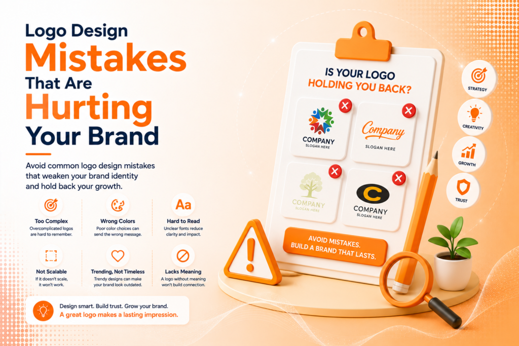
Many businesses looking for logo design ideas for business make the mistake of trying to fit too much into one mark multiple colors, intricate detail, or a design that tries to visually explain the entire business in one image. The result is often a logo that becomes unreadable at small sizes, like a favicon or app icon.
Professional logo design services typically approach this as a process of subtraction rather than addition starting with broader concepts, then removing everything that isn’t essential until only the clearest, most recognizable idea remains.
90%
Of first impressions are tied to color and visual design
3.5x
Faster brand recall with consistent, simplified visual identity
60%
Of businesses redesign their logo within 5 years due to early mistakes
Mistake #3: Ignoring Brand Consistency Across Touchpoints
Branding and identity extend far beyond the logo file itself a mark that looks slightly different across your website, social media, and printed materials quietly erodes the trust a consistent identity builds over time. This usually happens when there’s no documented system guiding how the logo should be used.
Brand identity design services address this by delivering more than just a logo a defined color palette, typography rules, and clear usage guidelines that keep every future application consistent, whether it’s an Instagram post or a client proposal, without reinventing the visual approach each time.
Mistake #4: Skipping the Redesign When It's Actually Needed
On the opposite end, some businesses hold onto an outdated or poorly designed logo far longer than they should, worried that a logo redesign will confuse existing customers. In reality, a thoughtful, gradual redesign refining rather than completely reinventing rarely causes the disruption business owners fear.
The signs it’s time for a logo redesign are usually clear: the mark doesn’t work well digitally, it looks visibly dated compared to competitors, or it no longer reflects what the business has grown into. Waiting too long often means the outdated logo has been actively working against the brand’s credibility for longer than necessary.
A logo doesn't fail because it's not creative enough it fails because it wasn't built to work everywhere a brand actually shows up.
Common Logo Design Mistakes to Avoid
Even well-intentioned businesses fall into familiar traps: choosing a design based on personal preference over strategic fit, skipping usage guidelines entirely, or redesigning reactively without a clear reason rooted in actual business needs.
The fix is rarely more creativity it’s more discipline. A simple, well-considered logo, applied consistently, will outperform a flashier one-off design almost every time.
How IWS Solutions Can Help
Our team provides professional logo design services and complete brand identity systems, helping businesses avoid these common mistakes from the very first concept, not after an expensive redesign becomes necessary.