
STYLE GUIDE
BRANDING
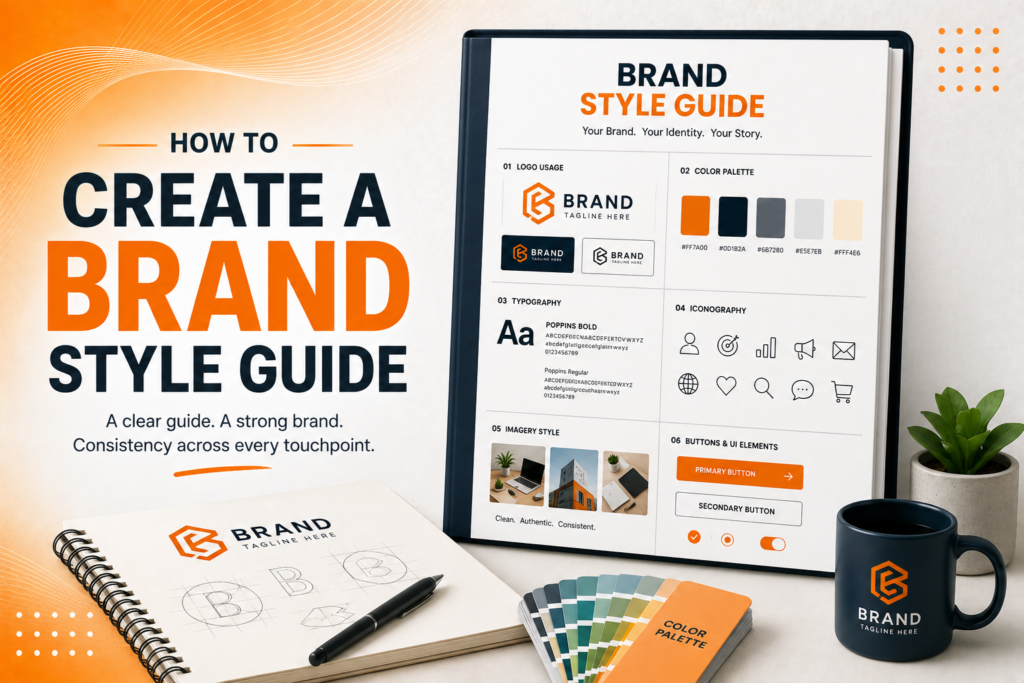
How to Create a Brand Style Guide
A practical, step-by-step guide to documenting your visual identity so every future design stays consistent, no matter who’s creating it.
Why Every Growing Brand Needs a Style Guide
A brand style guide is the reference document that keeps a business looking consistent across every touchpoint website, social media, packaging, and printed materials regardless of who’s actually creating the content on any given day. Without it, even small inconsistencies quietly accumulate until the brand starts feeling disjointed.
How to create a brand style guide starts with recognizing what it actually solves: the moment a business grows beyond one person handling every design decision personally, undocumented “rules” that live only in someone’s head become impossible to maintain consistently across a team, freelancers, or agency partners.
The Building Blocks of a Complete Style Guide
Brand guidelines aren’t one document with a logo pasted in they’re a comprehensive system covering every element that needs to stay consistent across future applications.
- Logo variations and clear spacing/sizing rules
- Defined color palette with exact codes for print and digital
- Typography system with font pairings and hierarchy
- Photography and imagery style direction
- Voice and tone guidelines for written content
When these elements are documented together, every future design decision starts from the same clear foundation instead of being reinvented each time.
Ready for a brand style guide that keeps everything consistent?
Documenting Your Logo System Correctly
Brand identity guidelines should never assume a single logo file covers every scenario. A complete logo section documents primary and secondary versions, minimum sizing requirements, clear space rules around the mark, and explicit guidance on acceptable background colors or contexts where each variation should be used.
This section also needs an equally clear “don’ts” list stretching the logo, changing its colors outside the approved palette, or placing it on backgrounds with insufficient contrast. Showing incorrect examples alongside correct ones removes ambiguity far more effectively than descriptive rules alone.
💡
Tip
Include real, incorrect examples of your logo being misused alongside the correct version. Seeing the mistake visually prevents far more errors than a written rule describing what not to do.
Defining Your Color Palette Precisely
A visual identity guide needs exact color specifications, not approximate descriptions like “our signature orange.” This means providing precise HEX codes for digital use, CMYK values for print, and Pantone references for specialized applications like merchandise or packaging, ensuring color reproduces consistently regardless of the medium.
Beyond the primary palette, documenting how colors should be used together which combinations are approved, appropriate ratios between primary and accent colors — prevents the gradual color drift that happens when different people interpret “use our brand colors” differently over time.
33%
Higher revenue for brands maintaining consistent visual identity
23%
Average increase in brand recognition with documented guidelines
80%
Of design inconsistencies traced back to missing or unclear guidelines
Setting Typography and Imagery Standards
The style guide’s typography section should specify exact font names, weights, and sizing hierarchy which typeface handles headlines versus body copy, and how heading levels should scale relative to each other across different applications, from website headers to printed materials.
Imagery style deserves equal documentation. Whether photography should feel bright and airy or moody and dramatic, whether illustrations follow a specific visual style, and how images should be cropped or treated all prevent inconsistent visual tone across marketing materials created by different people or agencies over time.
Including Voice and Tone Guidelines
A complete brand book extends beyond visuals to cover how the brand sounds in writing. Voice and tone guidelines describe the brand’s personality in written communication formal or casual, playful or serious along with specific language preferences and words or phrases to avoid entirely.
This section proves particularly valuable as a business scales content creation across multiple writers, ensuring blog posts, social captions, and email campaigns all sound like they’re coming from the same consistent brand voice, regardless of who actually wrote each individual piece.
A brand style guide isn't bureaucracy it's the difference between a brand that looks intentional and one that looks like it was designed by five different people who never spoke to each other
Common Brand Style Guide Mistakes to Avoid
Even well-intentioned businesses fall into familiar traps: creating an overly complex guide nobody actually reads, documenting visuals while ignoring voice and tone entirely, or creating the guide once and never updating it as the brand evolves.
The fix isn’t more pages it’s more clarity. A simple, clearly organized guide that’s actually used consistently will outperform an exhaustive document that sits unopened in a shared drive.
How IWS Solutions Can Help
Our team creates comprehensive brand style guides covering every visual and verbal element your brand needs, ensuring consistency across every future application, no matter who’s creating it.