
LOGO DESIGN
BRANDING
Wordmark vs Symbol vs Combination Logo: How to Choose
Three fundamentally different logo approaches, each suited to different business stages and brand recognition needs.
Why Logo Type Isn't Just an Aesthetic Choice
Wordmark vs symbol logo decisions genuinely affect how quickly and effectively a brand builds recognition, since each type carries different practical advantages depending on a business’s current stage, name recognition, and how the logo will actually be used across various applications and contexts.
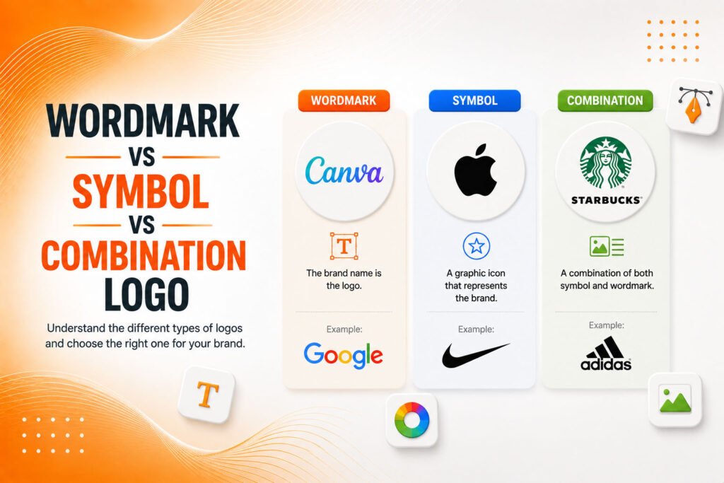
Types of logos generally fall into three primary categories: wordmarks (text-based logos using the company name), symbols (icon-based marks without text), and combination logos (pairing both text and icon elements together). Understanding the genuine tradeoffs between these approaches helps businesses choose deliberately rather than defaulting to whichever style simply looks most appealing without strategic consideration.
The Building Blocks of Each Logo Type
Logo design types each offer distinct advantages worth weighing against your specific business situation and long-term brand goals.
- Wordmarks build direct name recognition immediately
- Symbols offer flexibility once genuine recognition is established
- Combination logos balance name clarity with visual distinctiveness
- Each type requires different scalability considerations
- Brand maturity genuinely influences which approach fits best
Understanding these tradeoffs helps determine which logo type genuinely serves your specific brand stage and recognition goals.
Ready for a logo type that genuinely fits your brand's stage and goals?
When a Wordmark Logo Makes the Most Sense
Wordmark logo designs think Google, Coca-Cola, or FedEx work particularly well for newer businesses without existing name recognition, since the logo itself directly reinforces the company name every single time it’s seen, building that genuine recognition considerably faster than an abstract symbol customers haven’t yet learned to associate with the brand.
This approach also suits businesses with distinctive, memorable names that benefit from strong, deliberate typography treatment. A wordmark’s effectiveness depends heavily on thoughtful font selection and customization, since generic, unstyled text fails to create the same distinctive, ownable visual identity that a well-crafted wordmark genuinely achieves through careful typographic design choices.
💡
Tip
If your business name is difficult to pronounce, particularly long, or shared with numerous unrelated companies, a wordmark alone may struggle to build distinctive recognition. Consider whether a combination approach might serve you better.
When a Symbol Logo Makes the Most Sense
Symbol logo approaches think Apple, Nike, or Twitter’s bird generally work best for businesses that have already established genuine name recognition, or ones prepared to invest significantly in building that recognition over time before the standalone symbol alone can effectively represent the brand without accompanying text.
This approach offers genuine long-term flexibility advantages once established, since a symbol works cleanly across extremely small applications app icons, social media avatars, favicons where a full wordmark simply becomes illegible at such reduced scale, giving symbol-based brands a meaningful practical advantage for these specific, increasingly common small-format use cases.
73%
Of new businesses start with a wordmark or combination logo
58%
Of established Fortune 500 companies use symbol-only logos
5-10 Years
Typical brand maturity timeline before symbol-only transition succeeds
When a Combination Logo Makes the Most Sense
Combination logo designs pairing both text and icon offer genuine practical balance, particularly valuable for businesses still building initial recognition while also wanting a distinctive, memorable visual element beyond text alone. This approach allows flexible usage the full combination for primary applications, with the icon element alone usable for smaller-format contexts once sufficient recognition develops.
This flexibility makes combination logos a genuinely popular choice for growing businesses, since it essentially provides both a wordmark’s immediate name reinforcement and a symbol’s long-term scalability potential simultaneously, without requiring the business to choose exclusively between these two approaches from the very beginning.
Considering Your Brand's Genuine Maturity Stage
Which logo type is best genuinely depends on honestly assessing your current brand recognition level rather than aspiring toward what an established, recognizable company currently uses. Many iconic symbol-only logos actually began as combination or wordmark designs, transitioning to symbol-only usage only after years of building genuine, widespread recognition that made the standalone icon immediately identifiable without accompanying text.
Attempting to skip directly to a symbol-only approach before genuine recognition exists often results in a logo that fails to communicate the brand name clearly enough, potentially confusing or losing potential customers who simply don’t yet recognize what that unfamiliar icon actually represents without supporting text nearby.
A symbol-only logo isn't a sign of good design it's a sign of earned recognition. Most brands need to build that recognition before the symbol can stand alone.
Common Logo Type Mistakes to Avoid
Even ambitious businesses fall into familiar traps: choosing a symbol-only approach before genuine name recognition exists, selecting a generic, unstyled wordmark without distinctive typographic treatment, or building a combination logo where the icon and text elements don’t feel visually cohesive together.
The fix isn’t chasing whichever logo type looks most sophisticated it’s honestly matching logo type to your brand’s actual current recognition stage and realistic growth trajectory.
How IWS Solutions Can Help
Our team helps businesses choose and design the logo type genuinely suited to their brand stage, whether that’s a distinctive wordmark, a flexible combination mark, or planning toward future symbol-only evolution.