
ICON DESIGN
UI/UX
Icon Design: Small Details That Shape Big Impressions
Tiny visual elements that quietly do enormous work guiding users, reinforcing brand, and shaping how professional your product actually feels.
Why Icons Carry More Weight Than Their Size Suggests
Icon design often receives far less strategic attention than logos or full page layouts, despite icons appearing dozens of times throughout a typical user experience navigation menus, buttons, status indicators, and feature callouts all rely on icons to communicate meaning quickly, without requiring users to read explanatory text every single time.
Custom icon design matters because generic, mismatched, or inconsistent icons quietly undermine an otherwise polished interface, creating a subtle but genuine impression of carelessness. Conversely, a cohesive, thoughtfully designed icon set reinforces professionalism and attention to detail throughout an entire product experience.
The Building Blocks of Effective Icon Design
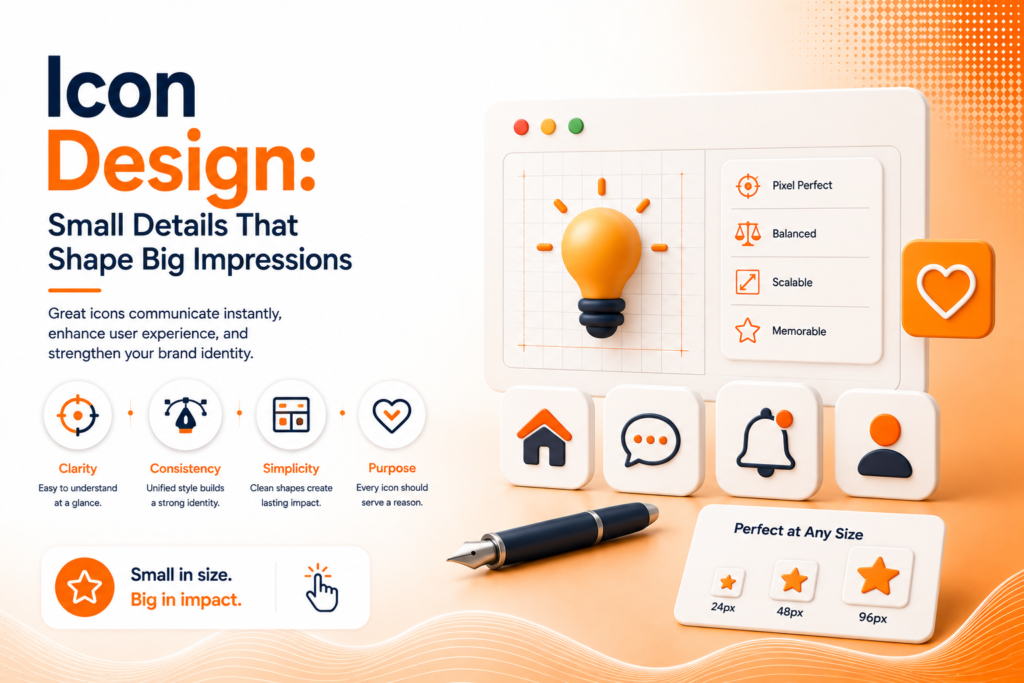
Icon design principles center on balancing visual consistency with immediate, intuitive clarity across every icon in a set.
- Consistent stroke weight and visual style throughout
- Clear, recognizable metaphors avoiding ambiguity
- Appropriate level of detail for actual display size
- Sufficient contrast against various backgrounds
- Scalability maintaining clarity across different sizes
When these principles are applied consistently, an icon set becomes an intuitive visual language rather than a collection of mismatched, individually designed symbols.
Ready for icons that genuinely reinforce your brand's professionalism?
Why Consistency Matters More Than Individual Cleverness
UI icon design succeeds most when every icon within a set shares consistent visual characteristics identical stroke weight, matching corner radius, consistent level of detail rather than each icon being individually clever or distinctive without regard for how it fits alongside every other icon appearing throughout the same interface.
Mixing icon styles, even subtly, creates a visually jarring inconsistency that most users notice on some level even without consciously identifying the specific issue. This inconsistency quietly signals a lack of attention to detail that can undermine trust in an otherwise well-designed product or website.
💡
Tip
Lay out your entire icon set together on one screen at actual display size. Inconsistencies in stroke weight, style, or visual balance become immediately obvious when icons are viewed side by side, rather than individually.
Choosing Clear, Recognizable Metaphors
Icon design tips consistently emphasize clarity over cleverness. An icon needs to communicate its meaning quickly and intuitively, ideally without requiring accompanying text to clarify an ambiguous symbol. Established conventions a magnifying glass for search, an envelope for email, a shopping cart for purchasing leverage existing user familiarity rather than requiring users to learn an entirely new, unfamiliar visual vocabulary.
Overly abstract or clever icon concepts, while sometimes visually interesting, often fail this core clarity test in practice. If user testing reveals people genuinely struggle to understand what a specific icon represents, that’s a clear signal to simplify toward a more universally recognized visual metaphor instead.
42%
Faster task completion with clear, intuitive icon design
89%
Of users rely on icons before reading accompanying text labels
67%
Of interface confusion traced back to inconsistent or ambiguous icons
Designing for Scalability Across Sizes
Icon set design needs to account for genuinely different display contexts a large feature icon on a marketing page requires different detail levels than the same concept shrunk down to a tiny navigation bar icon. Overly detailed icons that work beautifully at large sizes often become illegible, blurry messes when scaled down to their smallest actual use case.
This scalability consideration matters particularly for app icon design specifically, since app icons need to remain recognizable at extremely small sizes across various device home screens, while potentially also appearing much larger in app store listings and marketing materials simultaneously.
Ensuring Icons Work for Every User
Accessibility deserves genuine consideration in icon design too. Sufficient color contrast ensures icons remain visible for users with low vision, while avoiding purely color-based meaning distinctions like using only color to differentiate a success versus error icon ensures the interface remains usable for colorblind users who might not perceive that color difference clearly.
Cultural awareness matters as well, particularly for businesses with international audiences, since certain symbols or gestures can carry different, sometimes unintended meanings across different cultural contexts, making genuinely universal, carefully considered symbol choices particularly important for globally distributed products.
Nobody consciously notices good icon design they just notice that everything makes sense. That invisible clarity is exactly the goal.
Common Icon Design Mistakes to Avoid
Even design-conscious teams fall into familiar traps: mixing inconsistent icon styles across an interface, choosing overly clever or abstract metaphors that confuse rather than clarify, or failing to test icon legibility at the actual small sizes they’ll genuinely display at.
The fix isn’t more visual creativity it’s more consistency and clarity. A cohesive, intuitive icon set consistently outperforms individually striking but inconsistent icons almost every time.
How IWS Solutions Can Help
Our team designs custom, cohesive icon sets as part of every brand and interface project, ensuring these small visual details genuinely reinforce professionalism and usability throughout your entire product experience.