
COLOR THEORY
BRANDING
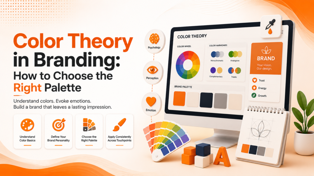
Color Theory in Branding How to Choose the Right Palette
Why the colors you choose shape perception before a single word is read and how to build a palette that genuinely fits your brand.
Why Color Choice Isn't Just a Design Preference
Color theory in branding matters because color is processed by the brain faster than shape or text, meaning it shapes a visitor’s first impression before they’ve consciously registered anything else about your business. Choosing brand colors based purely on personal taste, without strategic thought, risks sending a visual message that quietly contradicts what the brand actually stands for.
Color psychology branding research consistently shows that specific colors trigger fairly predictable emotional associations across most audiences associations that exist whether or not a business intentionally designed around them, making deliberate color choice a genuine strategic advantage over leaving it to chance.
The Building Blocks of an Effective Brand Palette
How to pick brand colors isn’t one favorite shade it’s a combination of strategic decisions that together create a cohesive, purposeful color system.
- A primary color reflecting core brand personality
- Complementary secondary colors for variety and hierarchy
- Neutral tones for backgrounds and supporting elements
- Sufficient contrast for accessibility and readability
- Consistent application across every brand touchpoint
When these elements work together, a color palette becomes a genuine recognition tool, not just a visual preference applied inconsistently.
Ready for a brand palette that actually reflects your identity?
What Different Colors Communicate
Brand color meaning follows fairly consistent patterns across Western audiences, even though exact associations can shift somewhat by culture and industry context. Blue frequently communicates trust, stability, and professionalism, explaining its heavy use across finance and technology sectors. Red signals energy, urgency, and passion, commonly seen in food and entertainment branding wanting to create excitement.
Green typically suggests growth, health, and environmental consciousness, while purple often carries associations with luxury, creativity, and premium positioning. Yellow and orange tend to communicate optimism, friendliness, and affordability colors frequently chosen by brands wanting to feel approachable rather than exclusive or formal.
💡
Tip
List three words describing your brand personality, then check whether your current primary color's typical psychological association actually matches those words. A mismatch here often explains why a brand's visuals feel "off" without an obvious reason.
Building a Complete Palette, Not Just One Color
Color theory for designers extends well beyond selecting a single favorite shade. A complete brand palette typically includes one primary color carrying the core brand personality, one or two secondary colors providing variety and visual hierarchy, and several neutral tones grays, off-whites, or muted shades supporting backgrounds and text without competing for attention.
This structure prevents the common mistake of a palette feeling either monotonous from relying on a single color everywhere, or chaotic from using too many competing colors without any clear hierarchy guiding when and where each one should actually be used.
90%
Of snap judgments about products are based on color alone
80%
Increase in brand recognition attributed to consistent color use
23%
Higher trust perception for brands using color psychology intentionally
Ensuring Accessibility Within Your Palette
A genuinely effective brand color palette accounts for accessibility, not just aesthetic appeal. Insufficient contrast between text and background colors creates readability problems for visitors with low vision or color blindness, an oversight that undermines usability regardless of how visually appealing a color combination might appear to typical viewers.
Testing color contrast ratios during palette development, rather than discovering accessibility issues after a website or materials are already produced, ensures the palette works genuinely well for the full range of people who’ll actually encounter it across different contexts and visual abilities.
Considering Industry Context and Differentiation
While color psychology provides useful general guidance, effective brand color palette decisions also consider industry context. If every competitor uses blue for trustworthiness, choosing a distinctly different color might actually help a brand stand out more effectively than following the expected industry convention exactly.
This balance between meeting audience expectations and genuinely differentiating from competitors requires understanding both color psychology principles and the specific competitive landscape a brand operates within, rather than applying color theory as a rigid, one-size-fits-all formula.
Color doesn't just decorate a brand it's often the very first thing communicating who that brand is, before a single word gets read.
Common Brand Color Mistakes to Avoid
Even design-conscious businesses fall into familiar traps: choosing colors based purely on personal preference, using too many competing colors without clear hierarchy, or neglecting accessibility contrast requirements entirely.
The fix isn’t the trendiest color combination it’s strategic alignment. A well-considered palette that genuinely reflects brand personality will outperform an aesthetically pleasing but strategically random one almost every time.
How IWS Solutions Can Help
Our team builds strategic, accessible brand color palettes as part of every brand identity project, ensuring your color choices genuinely reinforce your brand’s personality and stand out appropriately within your industry.