
WEB DESIGN
MINIMALISM
Minimalist Web Design: Why Less Is Often More
Removing the unnecessary doesn’t make a website feel empty it makes what actually matters impossible to miss.
Why Minimalism Isn't Just an Aesthetic Trend
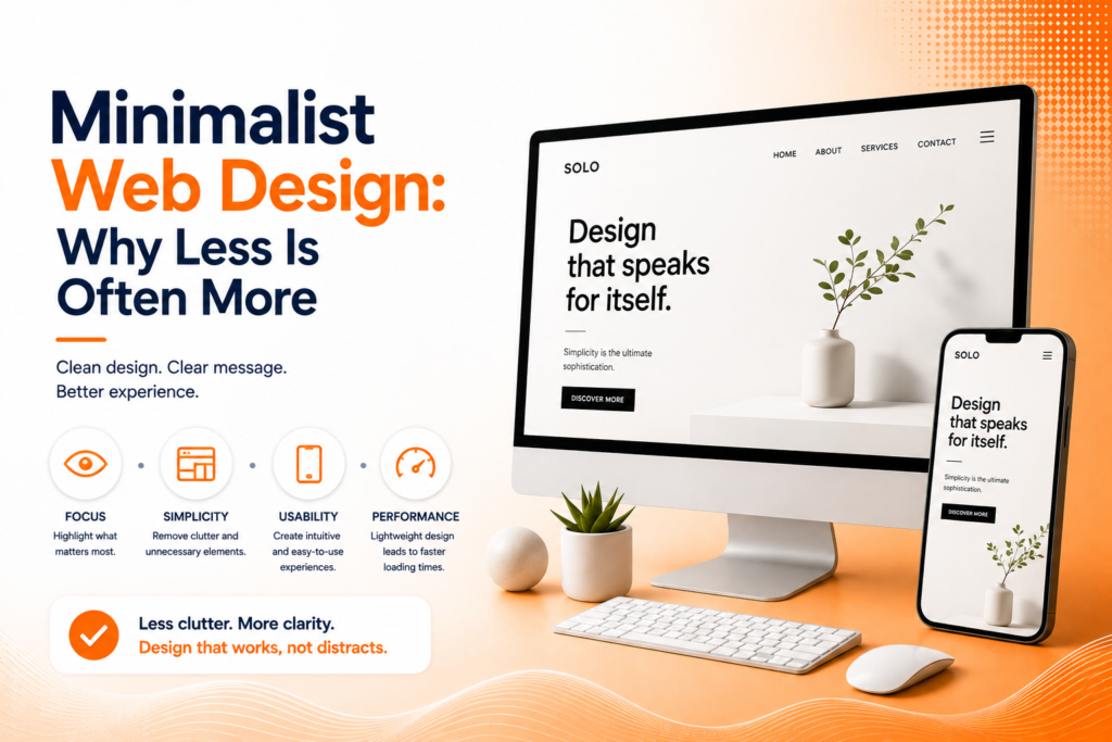
Minimalist web design gets sometimes dismissed as simply a passing visual trend, but its underlying principles reflect genuine usability advantages that extend well beyond aesthetic preference. A minimalist website reduces visual noise, helping visitors focus on exactly what matters your message, your product, your call-to-action without competing distractions diluting attention.
Less is more design succeeds because human attention is genuinely limited, particularly online where visitors decide within seconds whether to stay or leave. Every unnecessary element competing for that limited attention potentially distracts from the specific action or message a business actually wants visitors to notice first.
The Building Blocks of Effective Minimalist Design
Clean web design isn’t simply removing elements randomly it’s a deliberate combination of choices that together create clarity and focus.
- Generous white space directing visual attention
- A limited, intentional color palette
- Clear typography hierarchy without excessive variation
- Only essential navigation and interface elements
- Strategic use of negative space around key content
When these elements work together, minimalism creates genuine clarity rather than simply appearing sparse or unfinished.
Ready for a website where your message can't be missed?
The Genuine Purpose of White Space
White space in web design isn’t wasted, empty area it’s an active design tool directing visitor attention toward what genuinely matters. Generous spacing around a key headline or call-to-action naturally draws the eye there, while cramped, densely packed layouts force every element to compete equally for attention, ultimately diluting focus on anything specifically important.
This principle applies at every scale, from spacing between individual lines of text to the broader breathing room around major page sections. Minimalist UI design uses this spacing deliberately, ensuring visitors’ eyes naturally land on priority elements rather than becoming overwhelmed trying to process too many competing visual elements simultaneously.
💡
Tip
Try removing one element from your homepage that feels non-essential and observe whether anything genuinely important is lost. Often, removing elements clarifies rather than weakens the overall message.
Simplicity's Impact on Site Performance
Beyond aesthetics, minimalist website design frequently delivers genuine performance advantages. Fewer heavy visual elements, simpler code, and reduced overall page weight typically translate directly into faster load times a benefit that compounds both user experience and SEO rankings, since page speed remains a genuine, measurable ranking factor.
This performance benefit matters particularly on mobile devices, where simpler, cleaner layouts render more reliably across varying screen sizes and connection speeds compared to visually dense, complex designs that can struggle to maintain their intended appearance and speed across every device and network condition.
94%
Of first impressions relate to design simplicity and clarity
76%
Of users prioritize website ease of use over visual complexity
35%
Faster average load time for minimalist vs visually dense websites
Simplifying Without Losing Personality
A common concern with minimalist web design is that simplicity might strip away brand personality, resulting in generic, forgettable visuals. In practice, well-executed minimalism achieves the opposite a carefully chosen color, distinctive typography, or one bold visual element stands out far more powerfully within a simplified layout than it would competing against numerous other design elements simultaneously.
The discipline required for effective minimalism actually often produces more memorable, distinctive design than visually busy alternatives, since minimalist design forces genuinely intentional choices about which few elements deserve inclusion, rather than defaulting to including everything simply because there’s visual room available.
Knowing When Minimalism Might Not Fit
Minimalist web design suits many industries and brand personalities well, but it’s genuinely not universal. Businesses needing to communicate significant information density complex product comparisons, detailed technical specifications, or content-heavy resource libraries sometimes require a more information-rich approach than pure minimalism comfortably accommodates.
The underlying principle worth preserving regardless of overall visual density, though, remains consistent: intentional design choices, clear hierarchy, and avoiding unnecessary clutter genuinely improve usability whether a site leans toward minimal or more content-rich, information-dense design overall.
Minimalism doesn't mean having less to say it means saying it so clearly that nothing gets in the way of the message actually landing.
Common Minimalist Design Mistakes to Avoid
Even design-conscious businesses fall into familiar traps: confusing minimalism with simply removing content that visitors genuinely need, using excessive white space without clear visual hierarchy guiding attention, or sacrificing genuine usability in pursuit of an overly sparse aesthetic.
The fix isn’t removing everything possible it’s removing everything unnecessary while keeping what genuinely matters clear and prominent. Thoughtful minimalism consistently outperforms both clutter and empty, purposeless simplicity.
How IWS Solutions Can Help
Our team designs clean, intentional websites that use minimalist principles to sharpen focus on what genuinely matters, without sacrificing the personality and information your business needs to communicate.