
TYPOGRAPHY
WEB DESIGN
Web Fonts vs System Fonts What's the Difference?
A decision that affects both your website’s visual identity and its loading speed here’s how to choose wisely between the two.
Why This Technical Choice Has Real Design Consequences
Web fonts vs system fonts represents a genuine tradeoff between visual distinctiveness and technical performance, one that many businesses never consciously evaluate before their website simply defaults to whichever choice a template or developer happened to select initially.
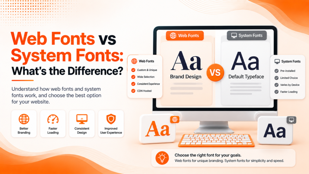
Web fonts are custom typefaces loaded from an external source specifically for your website, giving you access to virtually unlimited font choices beyond what’s pre-installed on a visitor’s device. System fonts, by contrast, use whatever typefaces are already installed locally — fonts like Arial, Georgia, or San Francisco that load instantly since no additional download is required.
The Building Blocks of the Right Font Choice
Custom web fonts and system fonts each involve genuine tradeoffs that together determine which approach fits your specific brand and performance priorities.
- Web fonts offer distinctive, brand-aligned typography
- System fonts load instantly with zero performance cost
- Web fonts require careful optimization to avoid slowdowns
- System fonts limit visual distinctiveness across devices
- A hybrid approach often balances both priorities effectively
Understanding this tradeoff helps determine the right balance for your specific brand and performance needs.
Ready for typography that looks great and loads fast?
The Performance Cost of Custom Typography
Font loading performance is one of the most overlooked factors in overall website speed. Every custom web font requires an additional file download before text can render in that specific typeface, and poorly optimized font loading can cause visible delays, layout shifts, or a brief flash of unstyled text that visitors notice even if they can’t quite identify what’s happening.
This performance cost compounds when a site loads multiple font weights and styles unnecessarily bold, italic, and regular versions of several different typefaces can add significant loading weight that a simpler, more disciplined font selection would avoid entirely.
💡
Tip
Audit how many font weights and styles your site actually uses versus how many are currently loading. Removing unused weights is often one of the fastest, easiest website performance wins available.
Using Google Fonts Effectively
Google Fonts has become the most common source for custom web fonts, offering a vast, genuinely free library alongside relatively straightforward implementation compared to self-hosting custom font files independently. This accessibility has made distinctive typography achievable even for businesses without significant design or development budgets.
That said, Google Fonts still requires an external request to load, meaning even this convenient, widely-used solution benefits from careful implementation limiting the actual number of font weights loaded, and using modern loading strategies that prevent custom fonts from blocking a page’s initial render entirely.
0ms
Load time for system fonts, since no download is required
300–500ms
Typical loading delay for unoptimized custom web fonts
35%
Faster text rendering with proper font-display strategy implementation
Building Proper Fallback Font Stacks
Web font optimization includes defining a proper fallback font stack a sequence of alternative fonts a browser uses if the primary custom font fails to load or is still loading. A well-constructed fallback stack ensures text remains readable immediately, even before the custom web font finishes downloading, rather than displaying invisible or broken text during that loading gap.
Choosing fallback fonts with similar visual proportions to your primary custom font also minimizes the jarring visual shift that occurs once the custom font finally loads and replaces the temporary fallback, creating a smoother, less disruptive loading experience for visitors.
When System Fonts Make More Sense
For some businesses, particularly those prioritizing maximum site speed above all else, system fonts represent a genuinely reasonable choice rather than a compromise. Modern system font stacks using each device’s native, high-quality default typeface actually look considerably more polished than older default fonts once did, narrowing the visual quality gap that historically justified custom fonts more strongly.
This approach works particularly well for content-heavy sites like blogs or news publications, where reading performance and speed genuinely matter more to the user experience than achieving a highly distinctive, brand-specific typographic personality throughout every page.
The best font choice isn't the most distinctive one it's the one that balances your brand's visual identity against how fast you're actually willing to make visitors wait for it.
Common Web Font Mistakes to Avoid
Even performance-conscious businesses fall into familiar traps: loading unnecessary font weights and styles, skipping proper fallback font stacks entirely, or choosing custom fonts without ever measuring their actual impact on page load speed.
The fix isn’t avoiding custom fonts entirely it’s implementing them thoughtfully. A well-optimized custom font, loaded efficiently, can achieve strong visual distinctiveness without meaningfully sacrificing site performance.
How IWS Solutions Can Help
Our team implements web fonts strategically across every project, balancing distinctive brand typography with genuine performance optimization, ensuring your site looks great and loads fast.