
DARK MODE
WEB DESIGN
Designing for Dark Mode
More than just inverted colors a genuine design discipline with its own rules for contrast, hierarchy, and visual comfort.
Why Dark Mode Requires Its Own Design Thinking
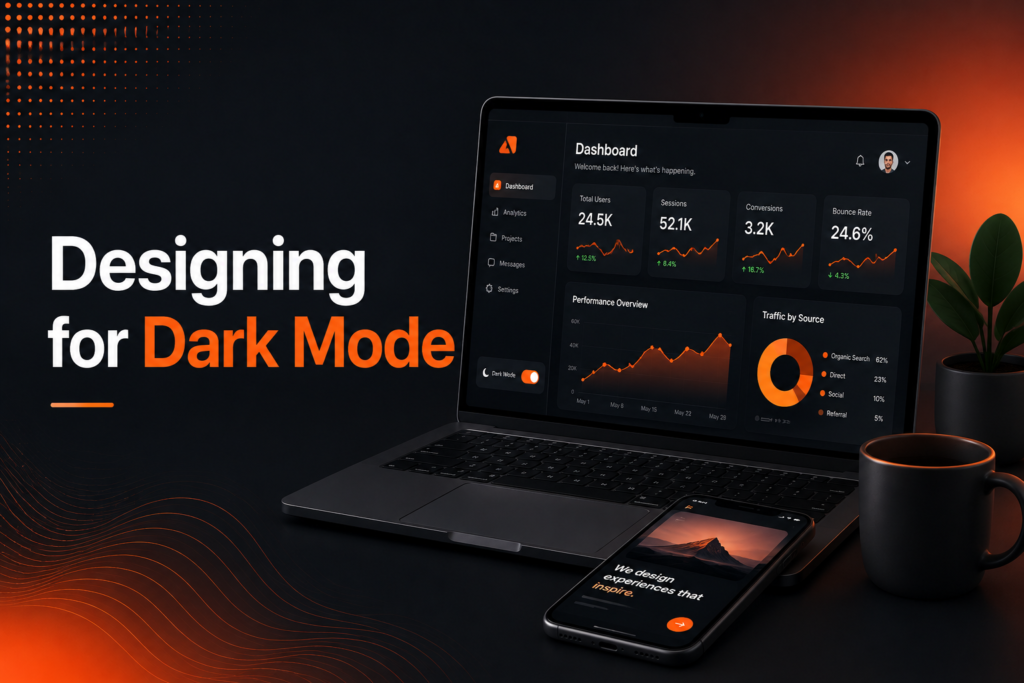
Designing for dark mode has evolved from a niche developer preference into a mainstream expectation, with most modern operating systems and applications now offering it as a standard option. Dark mode design isn’t simply inverting a light interface’s colors it requires genuinely rethinking contrast, hierarchy, and color choices to work well against a dark background.
Dark mode UI done poorly often results in harsh, overly bright elements against pure black backgrounds, creating genuine eye strain rather than the comfortable viewing experience dark mode is meant to provide. Getting this right requires understanding specific principles distinct from standard light-mode design conventions.
The Building Blocks of Effective Dark Mode Design
Dark mode best practices center on adapting familiar design principles specifically for how they function against dark backgrounds.
- Dark gray backgrounds rather than pure black
- Reduced contrast for large text and background areas
- Desaturated accent colors avoiding harsh, glowing effects
- Layered surface colors creating genuine depth and hierarchy
- Consistent testing across both light and dark implementations
When these principles are applied thoughtfully, dark mode becomes a genuinely comfortable, polished alternative rather than a hastily inverted afterthought.
Ready for a dark mode experience that's genuinely well-designed?
Why Pure Black Backgrounds Often Backfire
Dark mode website design frequently makes the mistake of defaulting to pure black backgrounds, assuming this represents the most authentic “dark” option available. In practice, dark gray backgrounds often in the range of very dark charcoal rather than absolute black typically create a more comfortable viewing experience, reducing the harsh contrast that pure black against bright white text can create.
This subtle distinction matters significantly for actual visual comfort. Pure black backgrounds paired with bright white text create genuinely high contrast that can cause a “halo” or glowing effect around text, particularly on OLED screens, whereas softer dark gray tones reduce this strain while still delivering the genuine dark mode experience users expect.
💡
Tip
Test your dark mode design in a genuinely dark room, not just a well-lit office. Contrast and brightness that feel appropriate in bright ambient light can feel harsh or uncomfortable in actual low-light viewing conditions.
Creating Depth Through Layered Surface Colors
Light mode vs dark mode design approaches differ significantly in how they communicate visual hierarchy and depth. In light mode, shadows naturally create a sense of elevation and layering. In dark mode, this same shadow-based approach becomes considerably less visible, requiring a different technique typically using progressively lighter shades of gray for elements meant to appear “elevated” or “on top” of the base background.
This layered approach helps maintain clear visual hierarchy that dark mode’s inherently lower overall contrast might otherwise flatten. Cards, modals, and interactive elements meant to stand out from the background benefit from this subtle shade progression, creating genuine depth without relying on traditional shadow techniques that work less effectively against dark backgrounds.
82%
Of smartphone users regularly use dark mode when available
30%
Battery savings on OLED screens from genuine dark mode usage
67%
Of users report reduced eye strain using dark mode in low-light conditions
Adapting Color and Accent Choices
Dark mode UI requires adjusting saturated colors that work fine in light mode but can appear overly vivid or almost glowing against dark backgrounds. Slightly desaturating or adjusting brightness levels for accent colors, buttons, and interactive elements typically produces a more comfortable, professional appearance than simply reusing identical bright colors from a light mode design without adjustment.
Images and photography also sometimes need consideration in dark mode contexts, since images with white or light backgrounds can create jarring, bright rectangles interrupting an otherwise cohesive dark interface. Some sites apply subtle adjustments or padding treatments to help images integrate more smoothly within the overall dark mode aesthetic.
Building Smooth, System-Aware Mode Switching
Modern dark mode implementation increasingly detects and respects a user’s system-level preference automatically, rather than requiring manual toggle selection every time they visit a site. This system preference detection provides a smoother, more considerate experience, immediately matching the user’s already-established preference from their device settings.
For sites offering manual toggle options alongside system detection, smooth, well-animated transitions between light and dark modes rather than an abrupt, jarring instant switch genuinely enhance the perceived quality and polish of the overall implementation, reinforcing attention to detail throughout the design.
Dark mode done well isn't just light mode with the colors flipped it's an entirely separate design decision, made with the same care as the original.
Common Dark Mode Design Mistakes to Avoid
Even design-conscious teams fall into familiar traps: using pure black backgrounds that create harsh contrast, simply inverting light mode colors without genuine adjustment, or neglecting to test actual accessibility contrast ratios within the dark mode implementation specifically.
The fix isn’t treating dark mode as an automatic color inversion it’s designing it as its own genuine, carefully considered experience with distinct principles guiding contrast, depth, and color choices.
How IWS Solutions Can Help
Our team designs genuinely polished dark mode experiences as part of complete website projects, applying proper contrast, depth, and color principles rather than a hastily inverted afterthought.