
WEB DESIGN
GRID SYSTEMS
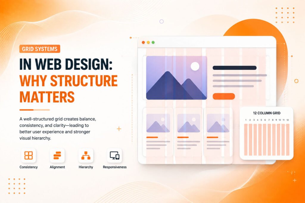
Grid Systems in Web Design: Why Structure Matters
The invisible framework holding every well-designed page together and why abandoning it usually creates more problems than freedom.
Why Structure Enables Rather Than Restricts Design
Grid systems in web design provide an underlying, often invisible structural framework organizing content into consistent columns and rows, creating alignment and visual order that guides how elements relate to each other across an entire page or website. Without this structure, layouts tend toward inconsistency, even when individual elements are each well-designed on their own.
Web design grid systems might initially seem like a constraint limiting creative freedom, but experienced designers generally recognize the opposite is genuinely true a solid grid actually enables more confident, faster design decisions, since the underlying structure removes countless arbitrary alignment and spacing choices that would otherwise require individual consideration for every single element.
The Building Blocks of Effective Grid Systems
Grid based design principles combine several structural elements that together create genuine visual consistency and organizational clarity.
- A defined column structure, typically 12 columns for flexibility
- Consistent gutters and spacing between grid elements
- Clear margins framing content within the overall layout
- Responsive breakpoints adapting the grid across device sizes
- Baseline alignment ensuring vertical rhythm throughout content
When these elements work together, a grid system creates genuine visual order that guides both design decisions and user perception of a well-organized, professional layout.
Ready for a website built on a genuinely solid structural foundation?
Understanding the 12-Column Grid Standard
12 column grid systems have become a common industry standard largely due to their mathematical flexibility twelve divides evenly into halves, thirds, quarters, and sixths, allowing designers to create numerous different layout combinations (2-column, 3-column, 4-column arrangements, and more) all working consistently within the same underlying structural framework.
This flexibility matters practically because real websites rarely need identical layouts across every single page or section. A homepage might use a 4-column product grid, while a blog post uses a simpler 1-column reading layout, yet both can share the same underlying 12-column foundation, maintaining consistent margins and alignment even as the specific visual arrangement genuinely differs between different page types.
💡
Tip
Overlay a 12-column grid visualization on your current website design. Elements that don't align cleanly to grid columns often reveal exactly where visual inconsistency is quietly undermining an otherwise polished design.
Why Consistent Spacing Matters as Much as Columns
Layout grid design isn’t only about column structure consistent spacing, specifically the gutters between columns and margins framing overall content, plays an equally important role in creating genuine visual harmony. Inconsistent spacing between elements, even when column alignment is technically correct, creates a subtle but genuinely noticeable sense of disorganization that undermines overall design quality.
This consistency extends to vertical spacing as well, sometimes called baseline alignment ensuring text and elements align to a consistent vertical rhythm throughout a page, not just horizontal column alignment alone. This combined horizontal and vertical consistency creates the genuine sense of intentional, careful organization that distinguishes professional design from amateur, ad-hoc layout decisions.
94%
Of first impressions relate to visual organization and layout clarity
12
Most common column count for flexible, modern grid systems
35%
Faster design decision-making with an established grid framework
How CSS Grid Made Implementation Genuinely Easier
CSS grid layout, a modern browser-native technology, has significantly simplified how designers and developers actually implement grid systems in real code, compared to older techniques that relied on more complex, sometimes fragile workarounds to achieve similar structural results. This native support allows genuinely flexible, responsive grid implementations without excessive additional code or framework dependencies.
This technical accessibility has made grid-based design more achievable even for smaller teams or projects without extensive front-end development resources, since modern CSS grid capabilities handle much of the previously complex responsive behavior automatically, adapting column arrangements cleanly across different device sizes with considerably less custom code required than older approaches demanded.
Knowing When to Deliberately Break the Grid
Grid based design principles don’t require rigid, absolute adherence in every single instance. Experienced designers sometimes deliberately break from the underlying grid for specific, intentional visual emphasis a full-bleed image spanning beyond normal margins, or an element deliberately overlapping grid boundaries to create genuine visual interest and draw particular attention.
This deliberate grid-breaking works precisely because it stands out against an otherwise consistent, grid-aligned layout. Without that underlying structural consistency established throughout the rest of the design, occasional deviations lose their intended emphasis entirely, simply blending into what would otherwise read as generally inconsistent, ungoverned layout throughout the whole page.
A grid system is invisible when it's working visitors never consciously notice it, they just sense that everything feels genuinely organized and intentional.
Common Grid System Mistakes to Avoid
Even experienced designers fall into familiar traps: applying inconsistent spacing despite proper column alignment, breaking the grid too frequently without genuine intentional emphasis, or skipping grid planning entirely and relying purely on visual instinct for element placement and alignment.
The fix isn’t rigid, inflexible grid adherence in every case it’s establishing genuine underlying structural consistency, then making deliberate, purposeful exceptions when they genuinely serve a specific design goal.
How IWS Solutions Can Help
Our team builds every website on a solid, considered grid system foundation, ensuring genuine visual consistency and organization across every page, device, and layout variation throughout your site.