
GRAPHIC DESIGN
VISUAL DESIGN
Skeuomorphism vs Flat Design
Neither style truly “won” both left a lasting mark on how digital interfaces genuinely communicate with users today.
Why This Design Debate Still Matters
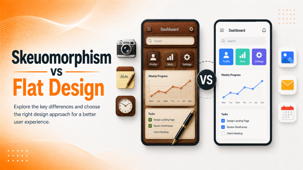
Skeuomorphism vs flat design often gets discussed as a settled argument from the early smartphone era, but the underlying tension realism versus simplicity genuinely still shapes interface decisions today. Skeuomorphic design mimics real-world textures and objects, like a notes app styled to look like torn paper, while flat design strips interfaces down to clean shapes, solid colors, and minimal visual embellishment.
Understanding why each approach rose and eventually gave way to the next reveals genuinely useful principles for modern interface decisions, rather than simply picking whichever style currently feels fashionable.
The Building Blocks of Each Design Philosophy
Comparing skeuomorphism and flat design means examining several distinct dimensions that together reveal why each approach emerged when it did.
- Visual realism versus deliberate simplification
- Learnability for genuinely new technology users
- Screen resolution and rendering capability at the time
- Load performance and interface responsiveness
- Brand personality and emotional tone conveyed
When these dimensions are considered together, both styles reveal genuine strategic reasoning rather than arbitrary aesthetic trends.
Ready to define a visual design direction that genuinely fits your brand?
Why Skeuomorphism Came First
Skeuomorphic design dominated early smartphone interfaces largely out of genuine necessity when touchscreens were new, mimicking familiar real-world objects helped users intuitively understand how to interact with an unfamiliar technology. A calendar app styled like a physical desk calendar, or a calculator resembling a real handheld device, reduced the genuine learning curve for a mainstream audience encountering touch interfaces for the first time.
As users grew genuinely comfortable with touchscreens, this realism became less necessary and increasingly felt visually cluttered rather than helpful, setting the stage for a deliberate shift toward simplicity.
💡
Tip
If your interface still uses heavy shadows, gradients, or textures purely for decoration rather than genuine usability guidance, consider whether that visual weight is still earning its place.
The Shift Toward Flat Design
Flat design emerged as users grew genuinely confident navigating digital interfaces without needing realistic visual cues to understand functionality. Stripping away shadows, gradients, and textures produced faster-loading, more scalable interfaces that translated cleanly across the rapidly growing range of screen sizes and resolutions.
This shift wasn’t purely aesthetic flat design’s simplicity genuinely improved performance and consistency, particularly important as responsive design became a technical necessity rather than a nice-to-have.
2013
Year flat design became mainstream following iOS 7's redesign
89%
Of modern app interfaces use primarily flat or near-flat design principles
64%
Of designers now blend subtle depth cues with flat design foundations
What Modern Interfaces Actually Borrow From Both
Genuinely modern interface design rarely commits fully to either extreme anymore. Subtle shadows, soft gradients, and light depth cues sometimes called “flat 2.0” or influenced by neumorphism have crept back into flat interfaces specifically to help users distinguish interactive elements from static content, addressing a genuine usability gap that pure flat design sometimes created.
This hybrid approach reflects a broader design lesson: neither realism nor simplicity is inherently superior, and the right balance depends genuinely on what helps users understand and navigate the specific interface in front of them.
Turning Design History Into Genuine Direction
Understanding skeuomorphism vs flat design only delivers real value when it informs actual interface decisions, rather than remaining an interesting historical footnote. Modern brands should ask which specific elements genuinely need visual affordance cues versus which can rely on established, familiar patterns users already understand.
This also benefits from periodic reassessment rather than a fixed style choice, since user familiarity with digital interfaces continues to evolve well beyond any single design trend
Skeuomorphism taught users how to use touchscreens flat design assumed they already knew. Modern design borrows honestly from both.
Common Mistakes to Avoid
Even experienced designers fall into familiar traps: adopting flat design so aggressively that interactive elements become genuinely hard to distinguish, or clinging to skeuomorphic detail that no longer serves any real usability purpose.
The fix isn’t choosing a side permanently it’s applying whichever visual cues genuinely help users understand and navigate the interface.
How IWS Solutions Can Help
Our team designs interfaces that draw genuinely from both design philosophies, balancing visual clarity with the depth cues users actually need to navigate confidently.